TICKETIER: Visual and UX design for the Artist Preference flow
Led the visual and UX design of the artist preference flow across web and app to reduce drop-off and capture user preference data for future product improvements.

Following the launch of TICKETIER, GMM Company Thailand’s new ticketing platform, the company wanted to collect artist preference data from end users to support future product improvements and inform event lineup planning. Users were expected to complete an artist preference selection form after signing in.
I led the visual design and UX flow for this feature, oversaw a junior designer, and mainly conducted design discussions with the client while communicating closely with developers. I also took primary ownership of the visual design, focusing on expressing the product’s brand identity and reducing drop-off during the selection process.
Timeline
Skills
UX Design Visual Design
Client
GMM Grammy
My Role
Product and Visual Designer
Team
Product and Visual Designer
Website
ticketier.com
What we wanted to achieve
Content limitation (no artist images)
Due to client and backend constraints, the team could not provide a data source to pull and display artist images in the feature. The challenge was to make the experience still feel appealing, clear, and usable using only artist names.Drive form completion without increasing drop-off from a forced experience
The client wanted users to complete all artist preference selections, but users also needed the option to skip the screen. The challenge was to keep the skip action available and lightweight while minimizing drop-off.Make selection easy without visual cues
Since the feature was intended to be simple and quick, users needed to complete the selection with minimal effort. Without artist images, the experience had to provide enough guidance and clarity for users to choose confidently.
Some ideas couldn’t meet the client’s expectation
Throughout the process, I translated the concept into both a mobile app and a desktop website to ensure the interaction worked well across platforms. Due to project constraints, aligning the solution with client expectations required several iterations and careful trade-offs. Overall, the feature took three weeks from requirements to final UI, and I took primary ownership from end to end.
Visual context and choice suggestions as key solutions
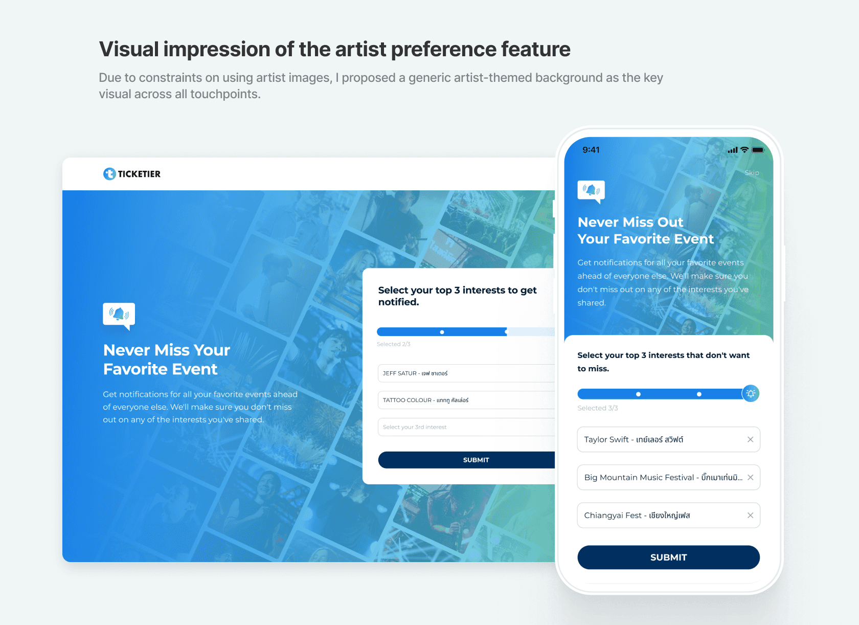
Visual impression of the artist preference feature
As there were constraints on using artist images, I proposed using a generic artist-themed background as the key visual for this feature across all touchpoints. This helped users recognize the purpose of the screen more easily and understand the context more quickly.Encourage users to complete the artist selection
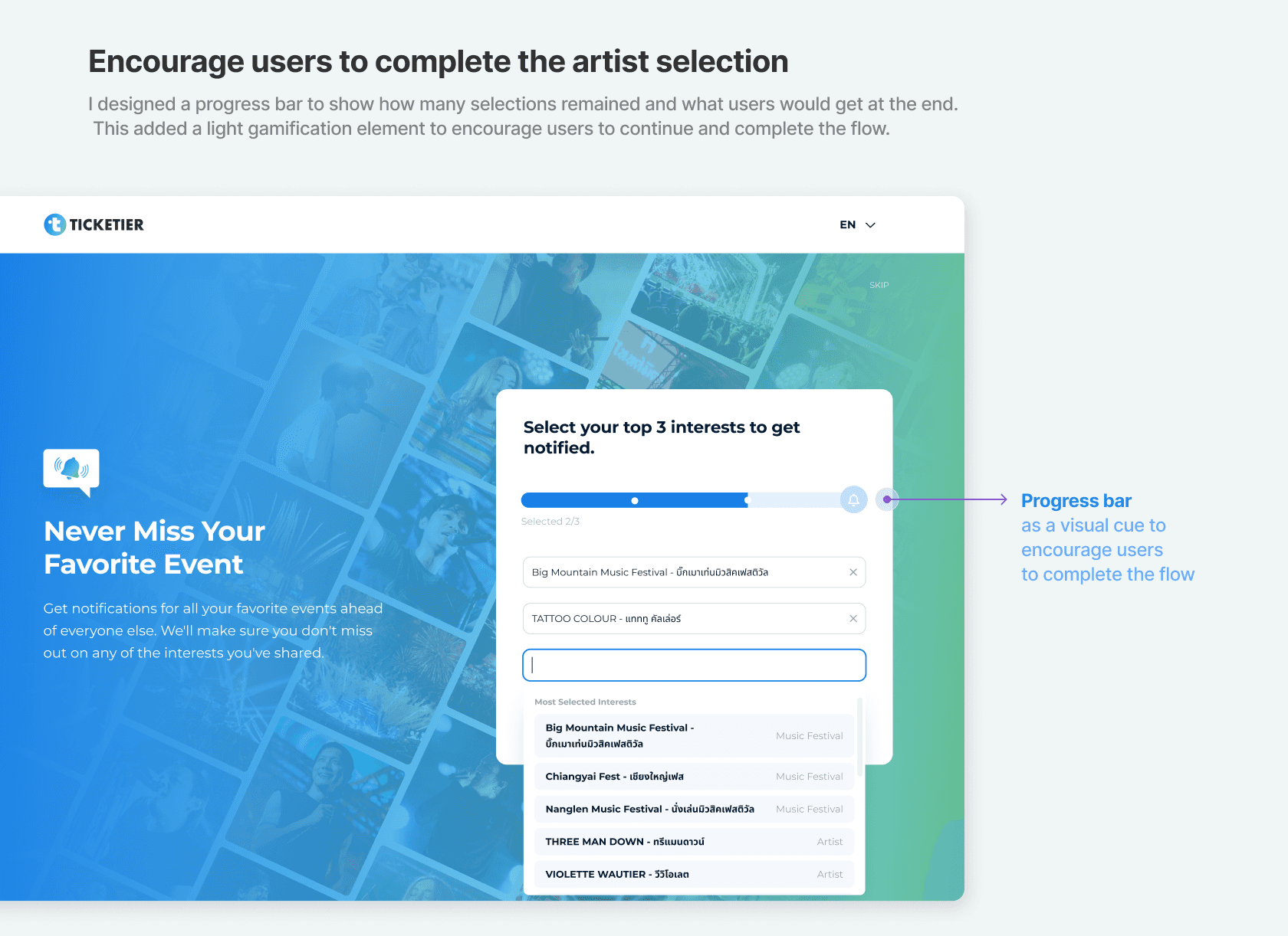
I designed a progress bar to show how many choices users still needed to complete and what they would get at the end of the process. This introduced a light gamification element that encouraged users to continue and complete the selection.Simple and continuous selection flow
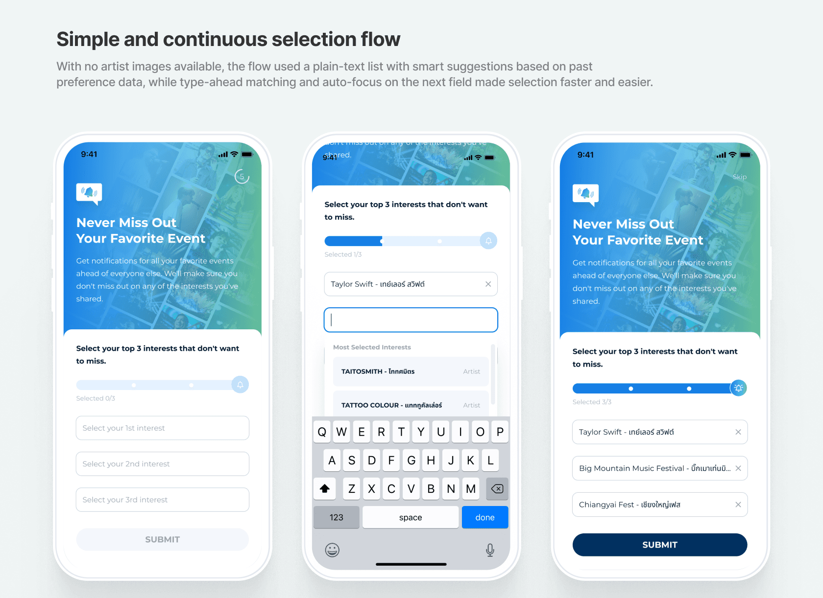
Since we were unable to fetch artist images, the selection had to be presented as a plain text list. To make the experience easier, we added suggestions based on the client’s historical data, highlighting artists that had been most preferred in the past. When users started typing their own choice, the field suggested matching artists based on the characters entered. After an artist was selected in one field, the next field was automatically highlighted to support a smoother, lower-effort selection process.Reduce drop-off while keeping skip accessible
We discussed this with the client and ran a brief test, then introduced a 5-second delay before enabling the skip button. This gave users enough time to understand the purpose of the page, while still keeping the skip option acceptable for users who were in a hurry. The decision was informed by Nielsen Norman Group guidance on users’ attention and scanning behavior.

Impact delivered
The feature launched across all touchpoints (app and website) in Q4 2024 and contributed to improved user data acquisition.
The flow achieved a 94% task completion rate, with a 6% skip rate in the artist preference flow.